
NCAA Football 15
Project Contribution: Art Direction | UI Design
The development of yearly game realeases necessitates everything be on very strict timelines. As a result, oftentimes there is not enough time to do everything you want to do, and pushing the release date backwards is never an option. For NCAA Football 15 I targeted an agressive full reskin of the game, but knew the team wouldn't have enough time to produce all 350+ screen that comprise the game in a regular 12-month cycle. To give us a chance I contracted out the amazing team at Clockwork Monkey Studios to develop the NCAA Football 15 style guide under my direction while the rest of my team completed NCAA Football 14 production cycle. The goal was to have the new style approved by the time alpha ended so we could immediately jump in to the reskin of the UI. This plan worked flawlessly and by the time NCAA Football 14 was on the shelves we had already reskinned a significant portion of NCAA Football 15.
I instructed the team at Clockwork Monkey to make the game feel nostalgic. I wanted 30 year olds to boot the game and feel the warmth of football fridays in the fall. I wanted them to see building and architecture that remind them of their years in college; to see the colors and logos of their team and have their minds wander back to their own days at school.
The resulting mocks you see on this page were created by myself and memebers of my local team after we approved the overall concept and direction from CWM.
Team Select is one of the most critical screens in the game. Users can not get into game without first seeing this screen, consequently it is one of the most used screens in the game.
My favorite feature of this design is the arrow scales. These were designed to give the user a visual sense of "how much" better one team is over the other. In previous iterations all ratings were communicated as simple numbers. If one player chooses LSU (which has an overall rating of 93) and the opposing player chooses Auburn (with an overall rating of 76), the users need mentally calculate the ratings difference between the two teams.
To fix this problem I devised the scales seen above. If both teams have the same rating then the scale point straight up as it is perfectly balanced. The stronger a team is the further towards that team the scale points. If one team is significantly better than the opposing team the scale will tilt all the way towards said team and start to bounce and shake - almost as if the scale is going to break. This was a final detail added to illustrate when a team has a significant advantage over the other team.


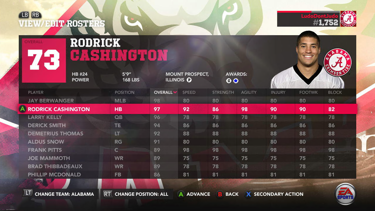
One of the core screens for the style guide are "Spreadsheet + Module" screens. These screens are template screens that are used for 10% of the screens in the game. They're critical for showing how the overall game style will work in the data-heavy core screens deeper in the game.


Collection of mocks showing the Recruiting Board feature.
Mock of the Filter common component. This component is used in nearly every screen in the game and is a core piece of UI functionality.
Common Controls examples are important for showing how individual components look in their various states. Each Common Control has a focused, unfocused, and disabled state. By showing examples of each state in a mock they can be implemented more easily by the production team of artists and tech artists.