

Madden NFL 16
Project Contribution: Art Direction | UI Design | UX Design | Playtesting | Style Guide | Technical Artist | Programming | Interaction Design | Motion Design
(click image for video)
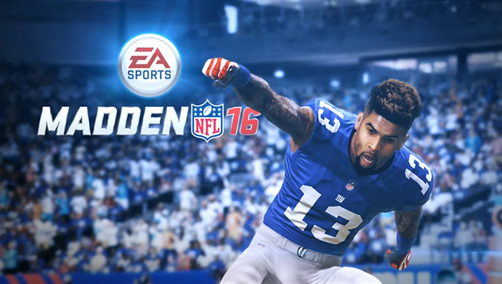
This was a first for Madden - a full motion video boot screen using rendered in-game graphics of our cover athlete (Odell Beckham Jr). We then applied post-processing to make it feel epic and to better match the color pallet of the interface. The final piece created greater energy and excitement for the user leading into the game.
“OMG! THIS IS THE BEST START SCREEN EVER IN MADDEN HISTORY!!”

(click image for video)
Redesigned Connected Franchise menu. New for Madden 16 was the "This Week" section to the left, which was designed to give the user a quick glance at upcoming milestones (such as the Super Bowl).
“Before even hopping into the game, you will quickly notice a huge improvement in Madden NFL 16’s UI. For years, one of the biggest, most frustrating complaints is that EA’s sports games has been the atrocious menu design. It would make simply moving from quick play to dynasty an absolutely unapproachable chore. Thankfully, that has been fixed with a new design that has almost no new issues.”

(click image for video)
One of the major "back of box" features for Madden NFL 16, this feature was also meant to be a gateway to Madden Ultimate Team Therefore, it was very important that this screen be more than a "just a screen" - it needed to be a presentation. I instructed the team that I wanted it to feel like you were watching a draft play out on television. To accomplish this we made sure to add more animations than you would normally see in a Madden screen, as well as integrated video effects and audio to really give each round a visual punch. The feature was extremely well received and continues to be popular in Madden today.

(click image for video)
Opening packs is the core loop of Ultimate Team and so it's very important that the experience be fun and feel rewarding. To accomplish this I integrated full motion videos as transitions for each card reveal, as well as using videos to differentiate card tiers (bronze, silver, gold, elite). In the past, all Ultimate Team cards were simple images, but I realized we could harness the power of video into the cards to really make them feel special and unique.

The integrated depth chart allows users to change their starting lineup without ever having to leave the main menu. The layout provides for an easy-to-digest view of your team's starters as well as your overall roster ratings. Micro interactions like a drag-and-drop animation help reinforce the user's interactions with the content. Tool tips provide contextual queues for how to spend XP, make substitutions, and view more player info.

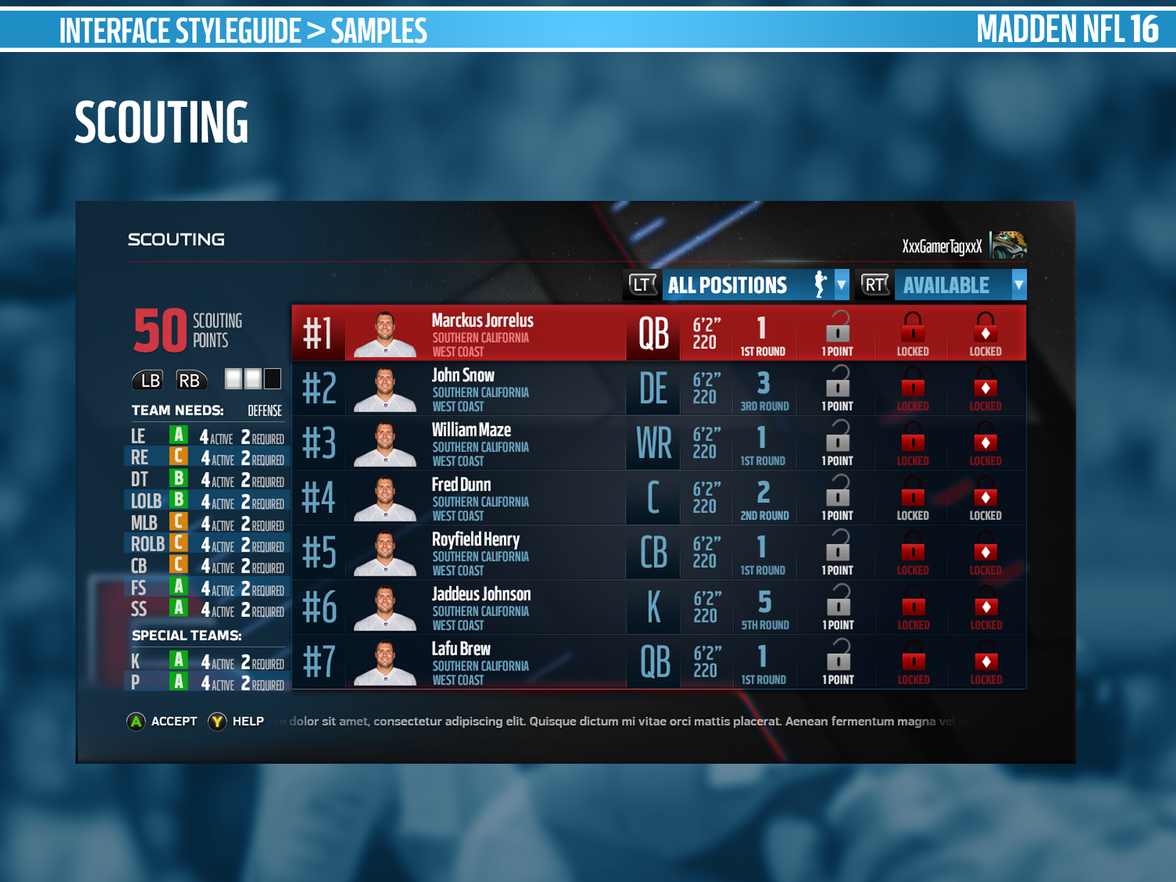
- Original high-fidelity mock-up of the Madden Draft Board feature. Originally the project manager wanted key upcoming dates displayed on the left-hand side of the screen. The filters shown on the top-right were a concept interaction I wanted to bring over from my time on NCAA Football.
- High-fidelity mock-up of the various states each player row could be displayed in. These states were used later for skinning/engineering requirements to ensure all necessary data was supported
- After performing play testing and acquiring user feedback, we realized users were moving back and forth between the old "team needs" screen ad the draft board. This revealed a deficiency in our design, as users were being forced to navigate in and out of this screen to find the info they needed. As a result, we removed the superfluous "Up next" data from the left side of the screen and integrated the team needs data into the screen.

Menu pop-outs allowed us to show users contextual information and options from within the main menu system, as opposed to forcing the user to navigate to an entirely new screen to make a decision. The result is the navigation feels more intuitive and connected to the actions. Decisions can be made as part of a natural user flow instead of forcing each decision to to be displayed on it's own screen.
“The first thing that you may notice about Madden NFL 16 is the slick interface that makes navigating the system a relatively flawless experience.”

Stills of the videos backgrounds in Madden NFL 16. Past iterations of Madden's backgrounds have been very busy and oftentimes clashed with the interface in the foreground. For Madden 16 I was inspired by the end credit sequence of The Avengers, which featured slowly panning up-close shots of the various Avengers' weaponry. We took that same idea and created slow motion videos that focused on football equipment. The final product was blurred out of focus just enough to so you could still make out what it was without it drawing attention away from the foreground. Some of these backgrounds can be seen in the videos above.


Sample style guide pages from Madden NFL 16. These pages helped to inspire the overall look and feel of the game and were used by junior artists to carry out the design under my supervision.